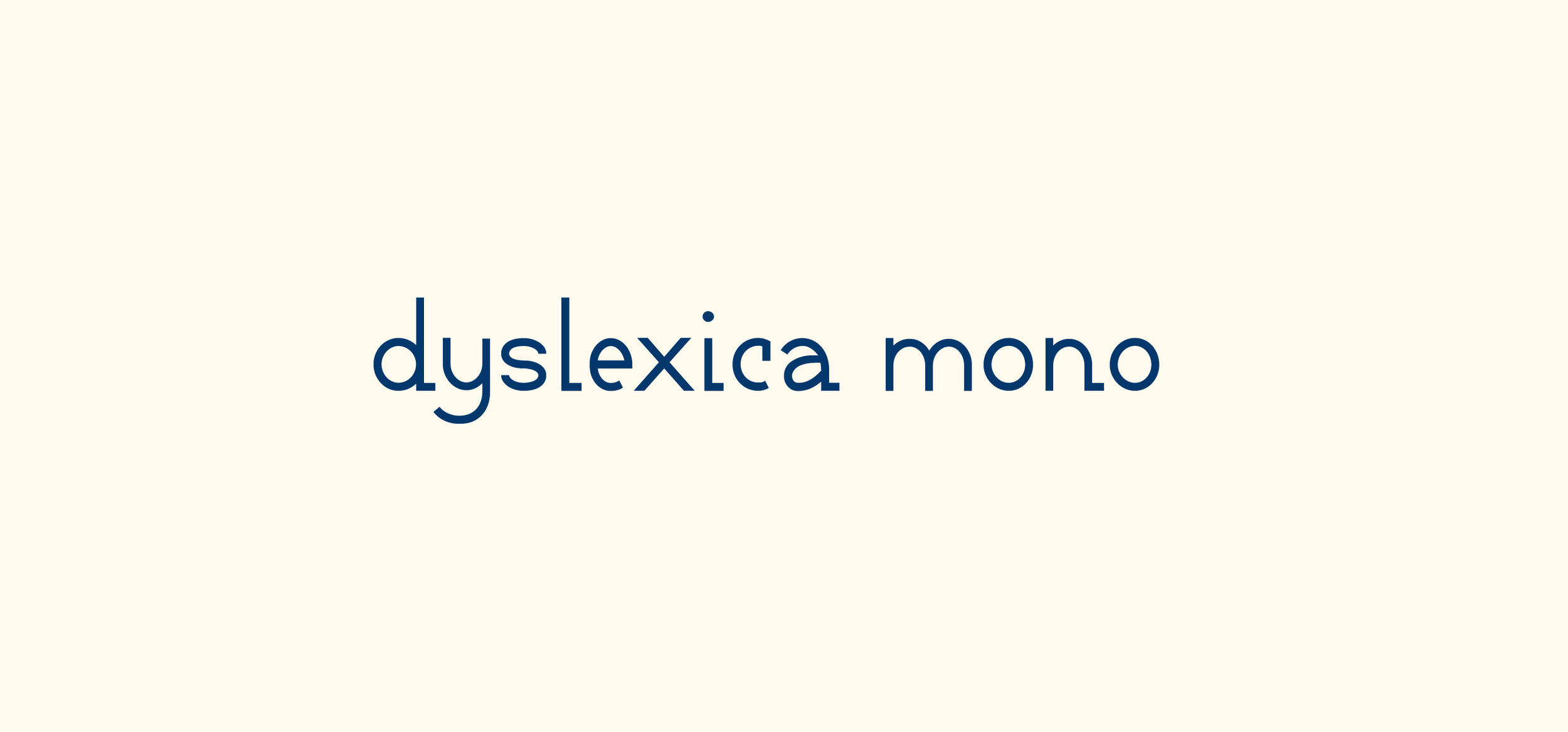
Dyslexica Mono
TYPOGRAPHY AS UX
Dyslexica Mono was created in 2018 during my time as a BFA student and explores the intersection of dyslexic legibility and designer desirability, focusing on how the experiences of both the designer and reader can be enhanced when creating accessible materials.

Can a typeface be an exercise in accessibility and user experience?
Dyslexia affects approximately 13-14% of the U.S. population, and as high as 20% of the population experiences symptoms of dyslexia. Most fonts created with dyslexic users in mind are niche and visually unappealing, unlikely to be used by designers. If designers aren't using accessible typefaces, readers with dyslexia are not seeing accessible type in the places they need it most. I set out on a mission to design Dyslexica Mono, a typeface that considered not only the user experience of dyslexic readers, but also of the designers creating written materials.
Standard principles for type design are fundamentally contradictory to the way a person with dyslexia reads.
One of the most common descriptions I found about dyslexia by those who have it (to explain it to those who do not) is that the letters often "float" off the page as if they are three-dimensional objects. As if each character was set on an axis, they are able to turn, rotate, and flip within that 3D space.
Because most typefaces are created with symmetry in mind, it can be extremely difficult for a person with dyslexia to determine which character is floating in space, particularly if they are unfamiliar with the context or word surrounding that character.

Above, the dark letterforms are the correctly oriented Dyslexica characters, and the dotted outlines are commonly confused letterforms (b, d, q, and p) rotated and reflected to demonstrate the uniqueness of Dyslexica’s serifs and counters.
The idea of creating a monospaced font was not my original plan. I initially began with a sans-serif version of Dyslexica, but quickly found my characters became kitschy and poorly constructed. For my project to meet my original goal, I had to consider the UX of a designer who needed an accessible typeface to be as appealing as a traditional typeface. Monospaced fonts are afforded a level of playfulness and distinctness that is often considered “too much” in a serif or sans-serif, so my experimentation branched off from there.
Additionally, an unpredictable, flexible third dimension to type was something I'd never had to consider, but was a challenge I welcomed. Inspired by monospaced typefaces, I realized that strategically placed serifs on similar letterforms could become directional indicators to orient readers. Dyslexica uses serifs on the right side of commonly mixed up characters such as b, q, d, and p, as well unique counters to combat symmetry to ensure each letterform is distinctive.

The full lowercase character set includes other minor-yet-crucial distinctions: a two-story "a" with a different counter than the similar letter "d," a flat-terminal "t" distinct from "f," and a shortened finial on the "e" and "c" to avoid appearing closed-counter like "o." Similar adjustments were made in the uppercase set. Unlike serifs, uppercase crossbars extend to the left.

When set in body text, the directional serifs help to create an implied baseline that is intended to help the reader orient the characters. When shown to friends and acquaintances with dyslexia, all agreed it felt natural to read (though no quantitative data was gathered).

At the time, I drew up characters for four different weights of Dyslexica Mono, though I only fully built out the book weight. Ideally, I'd love to redraw the typeface someday and add italics. Creating Dyslexica Mono began my journey into designing for accessibility and inspired me to consider how my designs function for marginalized groups in my projects going forward. Not many UX journeys begin with a typeface, but for me, I couldn't imagine anything more fitting.
